Dashboards: live tiles over your tables and reports
Assemble metric, chart, and table widgets that read live from any of your tables onto one canvas, arrange them, and pin the key ones to Today.
A dashboard is a single canvas of live tiles. Each tile (a widget) asks a small question of one of your Tables: a headline number, a chart, or a short list. Unlike a report, which is one filtered or summarized answer you export or deliver, a dashboard puts several answers side by side and keeps them current, so it is the surface you leave open to watch a slice of your operation at a glance. Dashboards are cross-table: different widgets on the same board can read from different tables.
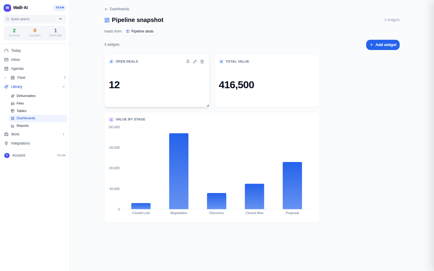
Every figure a widget shows is computed by the same deterministic engine that powers reports. A metric that says "42 open deals" ran an actual count; a bar chart of value by stage ran an actual grouped sum. Widget numbers are never estimated.
Open Dashboards
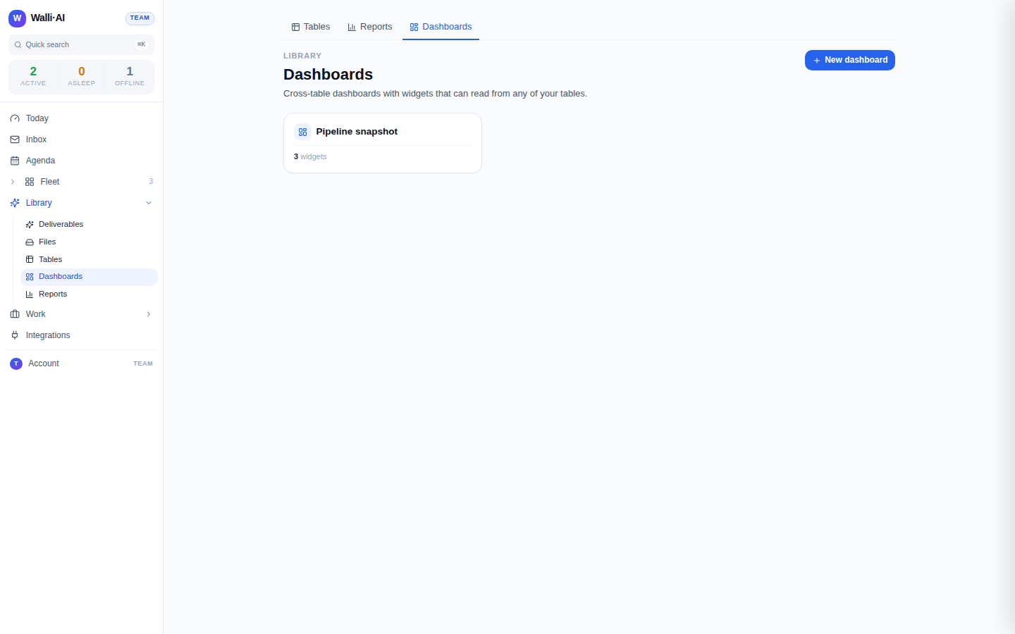
Go to Library -> Dashboards (/dashboards). The page lists your dashboards as cards, each showing its name and how many widgets it holds. Create one with New dashboard, which makes an empty board and opens it, or describe the first widget in plain language and let the platform build the dashboard around it. Delete a dashboard from its card, which asks you to confirm since it cannot be undone.
Inside a dashboard
Open a dashboard to edit it. The header carries the dashboard's name, which you edit in place, and a count of its widgets. Just below, a reads from strip lists the distinct tables the current widgets pull from, each a link back to that table, so the board's data lineage is always visible. The rest of the page is the canvas.
Add a widget
Add widget opens the widget builder. It has two ways in:
- Manual gives you the exact controls. Pick the Table the widget reads from, give it a Title, and choose a Type:
- Metric is a single number. Choose an aggregate (Count, Sum, Average, Min, or Max); every aggregate except Count needs a number column to act on, and the builder makes you pick one rather than saving a broken widget.
- Chart plots a series. Pick the Group by column (the X axis), the Series aggregate (the Y axis, again Count or a math aggregate over a number column), and a Chart style: bar, line, area, or pie.
- Table shows rows. Choose which columns to display (or leave all selected) and an optional row limit.
- Describe lets you type what you want ("total deal amount by stage as a bar chart") and drafts the widget spec for you. It then drops you back on the Manual tab with the fields filled in so you can review and adjust before saving.
Saving adds the widget to the board and runs it immediately so you see real data, not a placeholder.
Arrange the layout
Widgets sit on a grid you can rearrange. Drag a widget by its header to move it and drag its corner to resize it; the new layout saves on its own without re-running the data. Arrange the board so the numbers you check most sit top-left where your eye lands first.
Edit, delete, and refresh
Each widget has controls to edit its spec (which reopens the builder pre-filled) or delete it. Editing the spec and saving re-runs that widget against the current table data, so a dashboard is never stale: opening it re-runs its widgets, and saving a change re-runs what changed.
Pin a widget to Today
Any widget can be pinned to your Today page so its number or chart rides along with your daily brief. Pinning is capped at a small number of pins across all dashboards; when the limit is reached the board tells you to unpin something first rather than silently dropping the pin. This is how a single critical metric (open pipeline value, tickets waiting) follows you onto the page you start your day on without opening the dashboard.
Dashboard or report? How to choose
Dashboards and reports are built from the same engine and the same tables, so the choice is about shape and intent, not capability:
- Reach for a report when you want one dataset you can export or deliver: a filtered list, a grouped total, a spreadsheet, a formatted PDF, or a scheduled email. A report is a document you send. See Building a report and Sharing and exporting reports.
- Reach for a dashboard when you want several answers at once, kept live, that you glance at rather than send. A dashboard is a screen you watch. It is the only one of the two that spans multiple tables on one surface and the only one whose tiles can be pinned to Today.
A common pattern uses both: build the report you deliver weekly, and also add a chart widget for the same question to a dashboard you keep open. From the report builder, the Add to dashboard action does exactly this, turning a report into a live tile in one step (see Sharing and exporting reports).
Every information surface is also a launch pad
A dashboard is not a dead readout. Because its widgets are backed by real tables, the numbers are always drillable back to the rows behind them via the reads from links, and the same data an agent can act on. Use a dashboard to spot the thing that needs attention, then jump to the table, the report, or the agent that acts on it.
Tips
- Start a dashboard with one or two headline metrics and a single chart; add detail only once you know what you actually check daily.
- Name widgets for the answer ("Open deals", "Value by stage"), not the mechanics, so the board reads at a glance.
- Put the metric you most want to watch on a dashboard and pin it to Today so it is the first number you see each morning.
- If a widget shows a warning about a missing column, its table changed shape; edit the widget and re-pick the column, the same way you would re-point a drifted report.
- Keep one dashboard per audience or theme rather than one giant board; a focused canvas is easier to scan than a wall of tiles.